Overview
"Your one stop shop for all things home" is HomeStars' mission statement as of 2022, although they've been on this course for years. They began with a redesign of its entire platform beginning in 2015 with the vision of becoming Canada's largest marketplace for connecting homeowners with reputable contractors.
As the sole product designer at HomeStars for most of my tenure, I helped it grow from a relatively small startup into the huge organization it is today.
As the sole product designer at HomeStars for most of my tenure, I helped it grow from a relatively small startup into the huge organization it is today.
The Challenge
When I started, HomeStars was simply a directory website for reading & writing reviews of contractors. You had to know the name of the contractor/company you were looking for. This allowed you to double check the reputation and credentials of someone before you hired them. This helped the homeowner make an informed decision but did not solve the core problem of finding a recommended contractor in the first place.
The old interface was clunky and dated. Searching for a reputable contractor was a bit like pulling teeth: you had to browse by category and then click through each company one by one and read their reviews. At that time, companies were paying to have poor reviews removed while also paying fake reviewers to inflate their numbers. This would push the offending companies to the top of their categories. Instead of doing good work, being on ‘Page 1’ of the search results was their top priority.
The user experience at that time was pretty poor, and some homeowners ended up hiring some of these “top” companies to end up being disappointed at best (and ripped off at worst).
The approach to revamp all of this was multi-angled.
Web Redesign
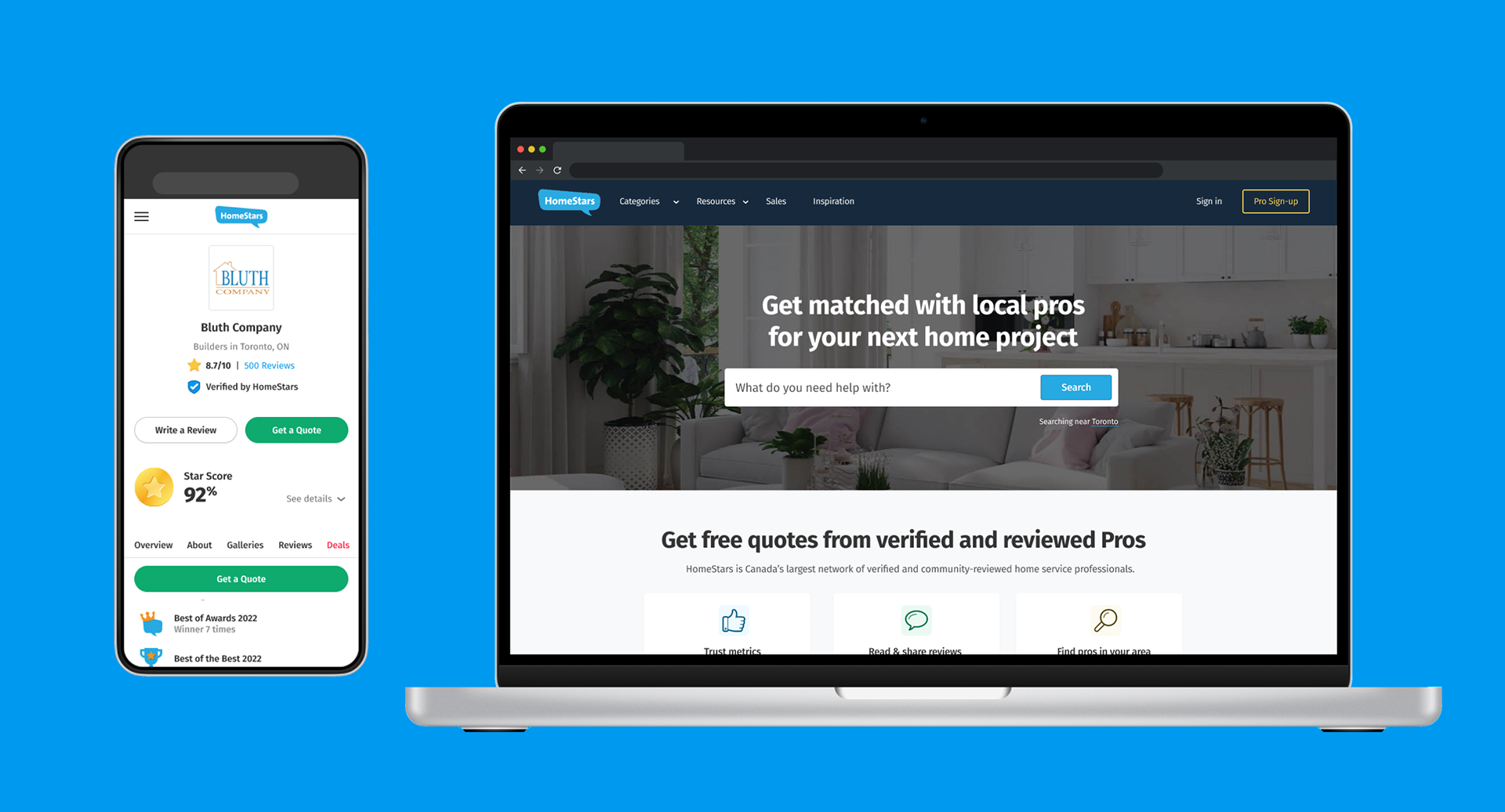
The first stage of modernizing the site was to clean up the home page in order to direct users into a specific flow: requesting a quote for a project. In order to do this, we had to remove a massive amount of clutter. Some obvious pain points with the original design were information hierarchy, a large number of CTAs and a general feeling of "where am I supposed to go?". Less obvious pain points included poor accessibility, inconsistent typefaces and low contrast.
A reduction in stimulation and increase in contrast helped send a clearer message of what the product is for and where to begin, while also cleaning up the visual identity of the brand. Our research showed that most people who arrived on the home page were referred by word-of-mouth, so they were already arriving with a purpose. These changes were designed to assist users in this purpose.
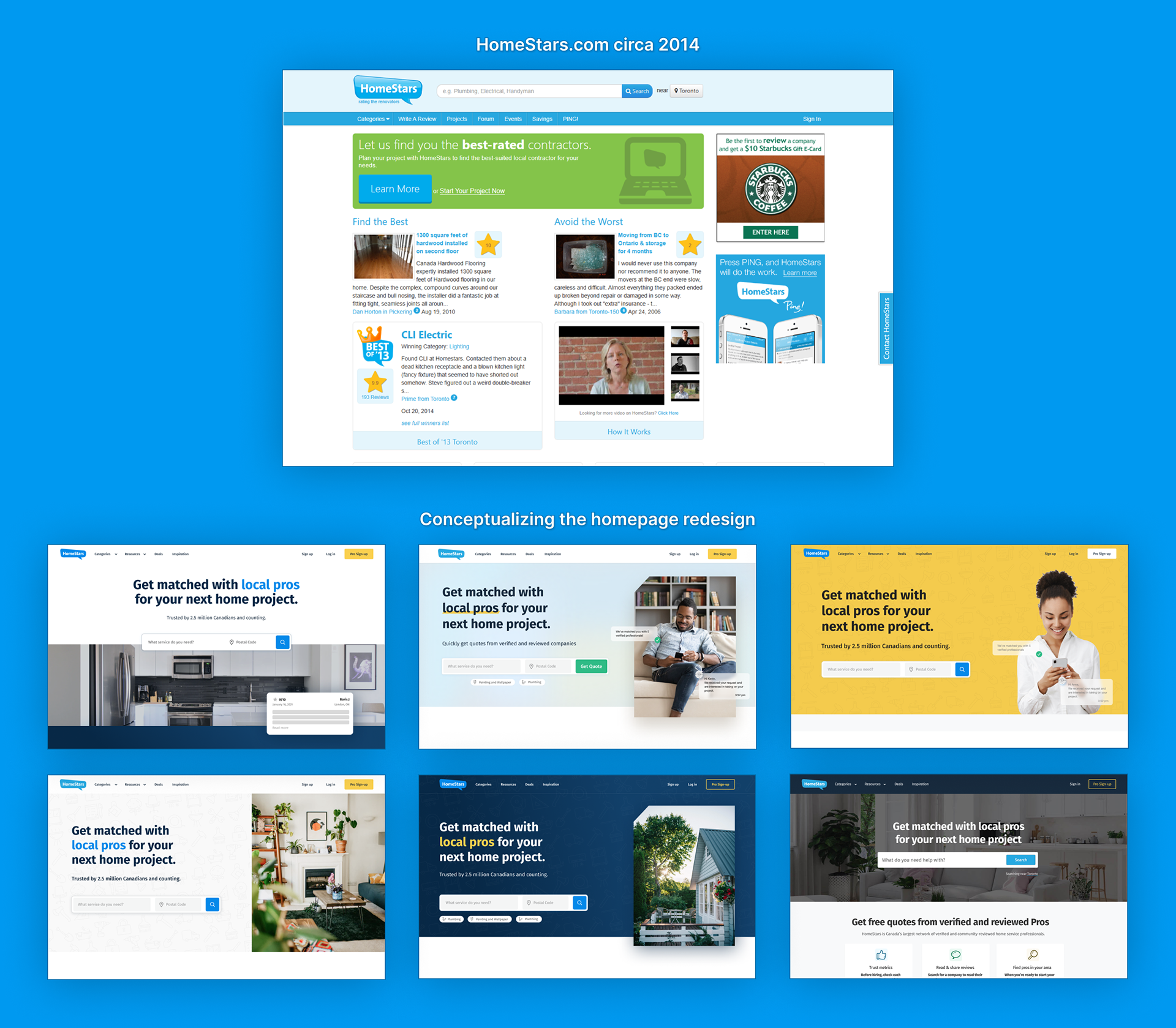
HomeStars.com homepage design iterations
The navigation was restructured and the search system re-engineered to start giving better recommendations. We started with cleaning up the review moderation UI to make it faster and easier for moderators to approve/deny reviews. We also began punishing companies for “review farming” (paying people to write dozens of good reviews) and attempting to remove negative reviews. Next, we removed paginated search results so companies would stop fighting for a spot on the “first page” of results. Both of these changes encouraged companies to focus on doing good work and spending less time trying to meta-game their review score.
To help homeowners find what they’re looking for more quickly, I designed new user flows allowing homeowners to describe their project and create job requests for specific companies or cast the request out as a wide net and allow contractors to bid on it. Along with the association form flows, a projects management interface was created along with a chat UI. This created a massive uptick in leads for the contractors and a lot of added value for our members.
The result of these changes was a more modern experience for users, more transparency and trust in our system, and more discoverability for companies who did good work, all leading to more positive interactions and a huge uptick in companies being hired through HomeStars. It also helped to attract younger, more savvy users to the platform.
Listing Pages
The initial approach to updating the listing pages was to try and move the user reviews higher up the page while moving the service pro’s self-made content (company bio, images, etc.) further down the page, while highly stylizing the header area for some visual interest.
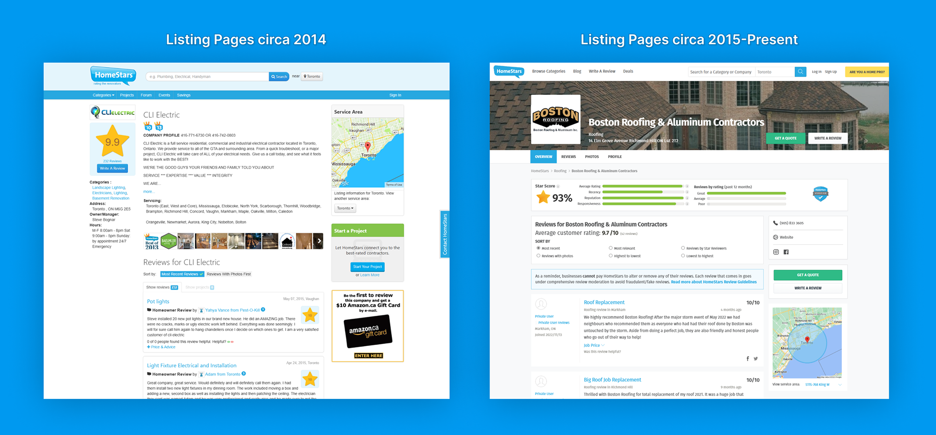
HomeStars listing page before & after initial redesign (2015)
While it looked cool and served us well at first, additional features, widgets, filters and badges were added to the layout over time and information overload became pain points for the homeowner users. Another issue was for the service pros -- the more we allowed them to customize their page layout, the more support calls we received.
Armed with years of user feedback and survey results, we set out to undergo another redesign of the listing pages in 2022.
Armed with years of user feedback and survey results, we set out to undergo another redesign of the listing pages in 2022.

Sketching out ideas
As a cross-functional team between product design, customer success coaches, sales and support, we sat down to discuss the user feedback and sketch out our ideas. We examined what was working with our content, what could be prioritized and what could be cut. We compared sketches, discussed new ideas, and found that our concepts shared a lot in common.
Early prototypes for the listing page
Simple low fidelity mockups for both mobile and desktop layouts were built for internal testing first. Prototypes with simple interactions and animations were tested for proof of concept within our team before moving on to testing with real users.
Speaking with homeowner users who were seeing the designs for the first time provided proof that our concepts were delivering on what we had set out to do. The page information was clear with the most helpful things being the easiest to find, and the design was cleaned up despite having a lot more content added. Spacing, sizing, and use of colour was carefully thought out.
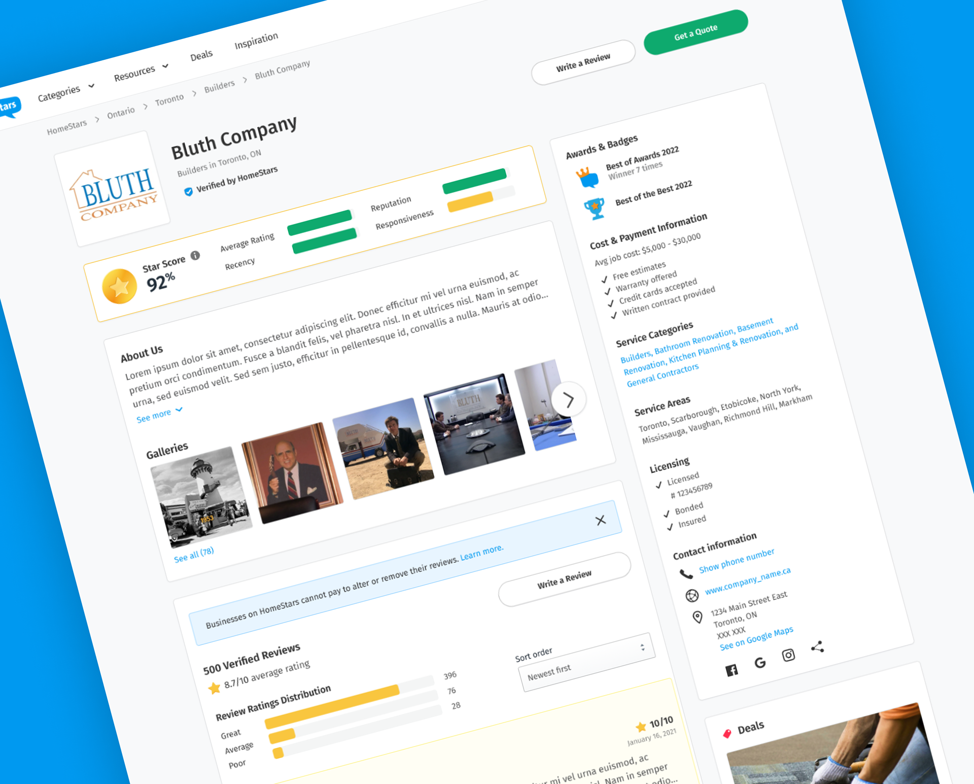
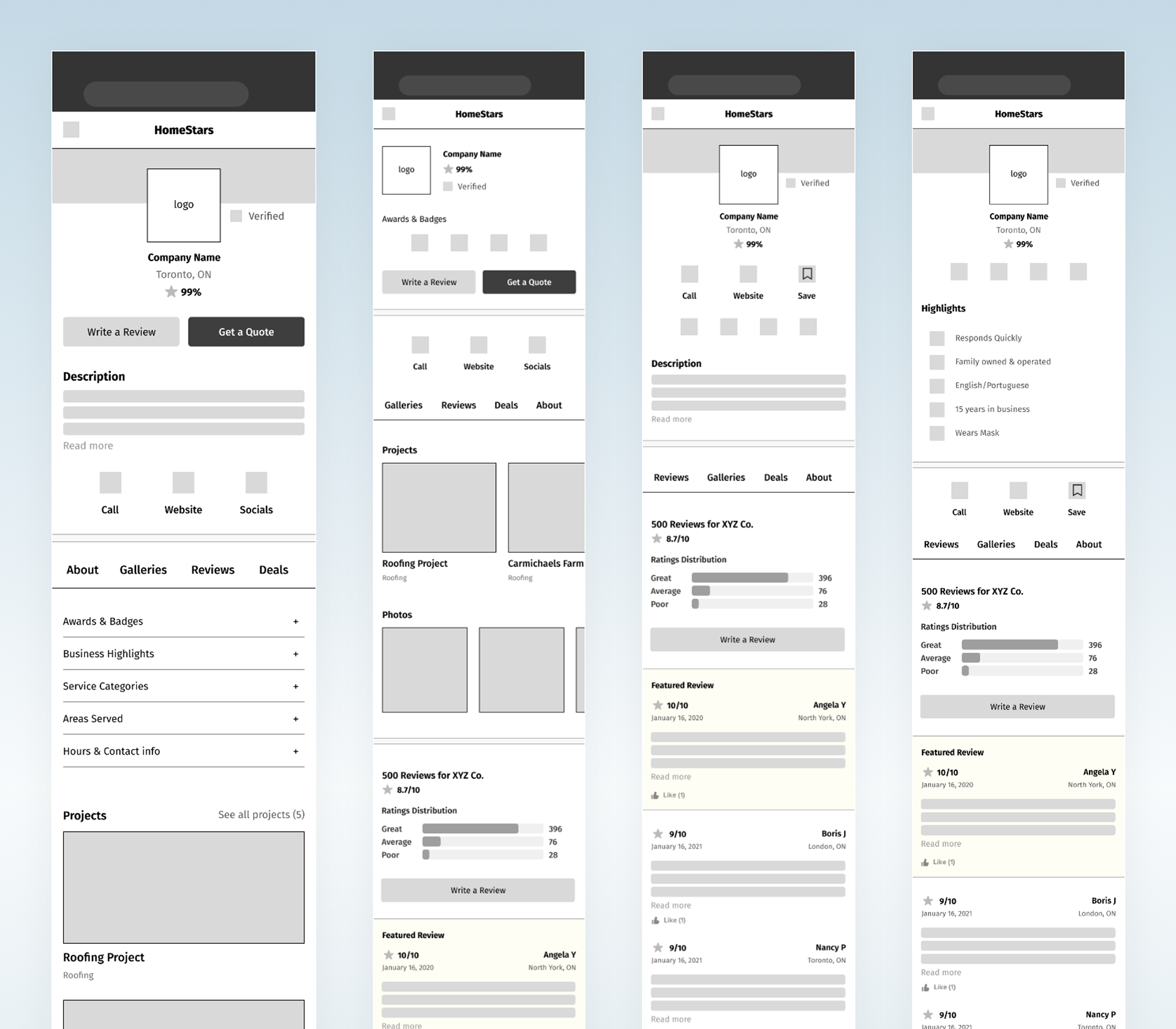
The brand new design of a contractor's listing page on HomeStars.
At a glance, the homeowner user can glean the quality of work of the service pro and make an informed decision on whether to hire.
The Star Score system we developed has proven to be a clear metric on the service pro’s performance, trustworthiness, and public opinion. This effectively removed the “gamification” of disputing negative reviews and farming for positive reviews by harshly punishing their score for doing so. This system has led to a focus on quality of work, responsiveness, and honesty which has directly improved the homeowner experience with hiring decisions.
The Star Score system we developed has proven to be a clear metric on the service pro’s performance, trustworthiness, and public opinion. This effectively removed the “gamification” of disputing negative reviews and farming for positive reviews by harshly punishing their score for doing so. This system has led to a focus on quality of work, responsiveness, and honesty which has directly improved the homeowner experience with hiring decisions.
The Pro Experience
The simple idea behind the HomeStars Pro mobile app was to make it quick and easy for service pros to receive new leads without being tethered to their computer. Pros can see lead details, accept/decline leads and chat with homeowners, as well as request and share homeowner reviews.
With over 80% adoption rate among contractors, the app has become a cornerstone to the Pro experience at HomeStars.
Additional features I worked on that were introduced after launch include: vacation mode, autoresponder, chat templates and a soon-to-be-launched redesigned dashboard which includes new insights and performance metrics, presented in a slick UI.
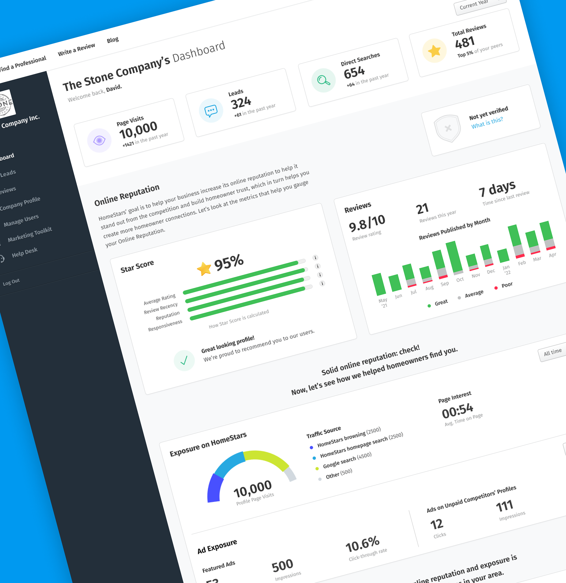
The redesign of the Pro dashboard
HomeStars Deals
In 2022 we also launched a new Deals and Promotions feature, so companies can advertise what specials they’ve currently got running, allowing them to stand above the competition. This included a Deals landing page explaining how launching a promotion would work, and an system for managing their deals once they bought into the feature.
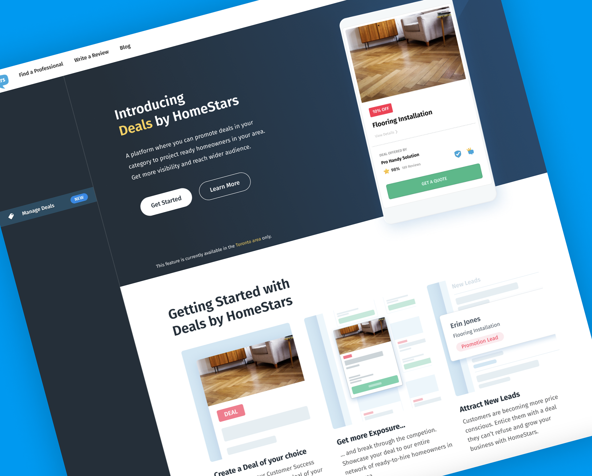
HomeStars Deals landing/buy-in page
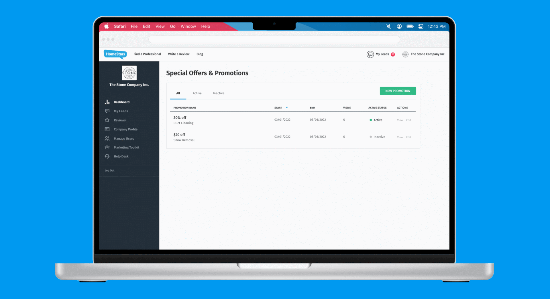
Deals & Promotions management interface
HomeStars Verified
I also was a part of developing the HomeStars Verified program, which is how the service pros verify their professional licensing and prove who they say they are. Verified professionals enjoy the benefit of increased credibility and qualification for the Best of Awards, dramatically improving their appeal to homeowners and increasing the amount of business driven to them by HomeStars.